Overview
ConsoliDoc is a digital storage platform that allows patients, caregivers, and medical professionals to easily store and access medical documents in one secure place, allowing for quick access to essential health information.
The project brief involved two main objectives. The first was to design a responsive website that introduced the startup to the public and encouraged user sign-ups and sales. The second objective was to create a clean, user-friendly, web-based dashboard that aligned with the visual language created for the website and incorporated new and updated solutions for an enhanced user experience, building upon rough existing wireframes.
My role
As the sole UI/UX and visual designer, I was responsible for shaping the narrative and visual language of the marketing website, and for crafting the user journey and interface for the dashboard. Under a tight timeline, I worked directly with the company founders, as well as a developer, to ensure that the website and dashboard met the startup's MVP objectives and provided an optimal user experience.
• Information Architecture
• User Flows
• Wireframing
• Prototyping
• Art Direction
• UI Design
• UX Copywriting
Driving Engagement Through
Thoughtful Website Design
Thoughtful Website Design
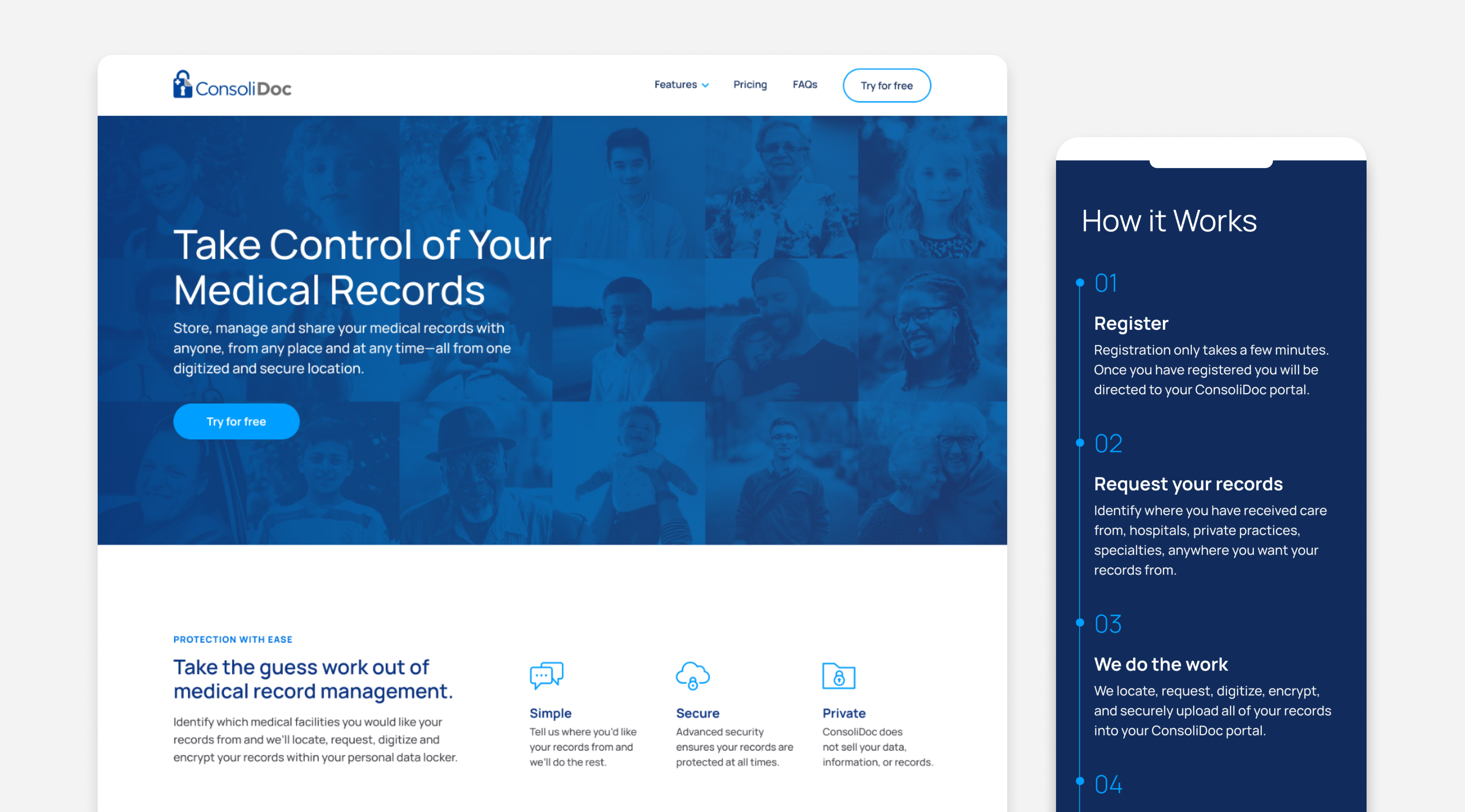
The website design was a crucial aspect of the project, aimed at driving user sign-ups and sales. I worked closely with ConsoliDoc's founders to understand the key points needed to effectively tell the startup's story. I shaped the narrative and built out the sitemap, wireframes, and visual language, including typography, color, icon design, and photography selection.
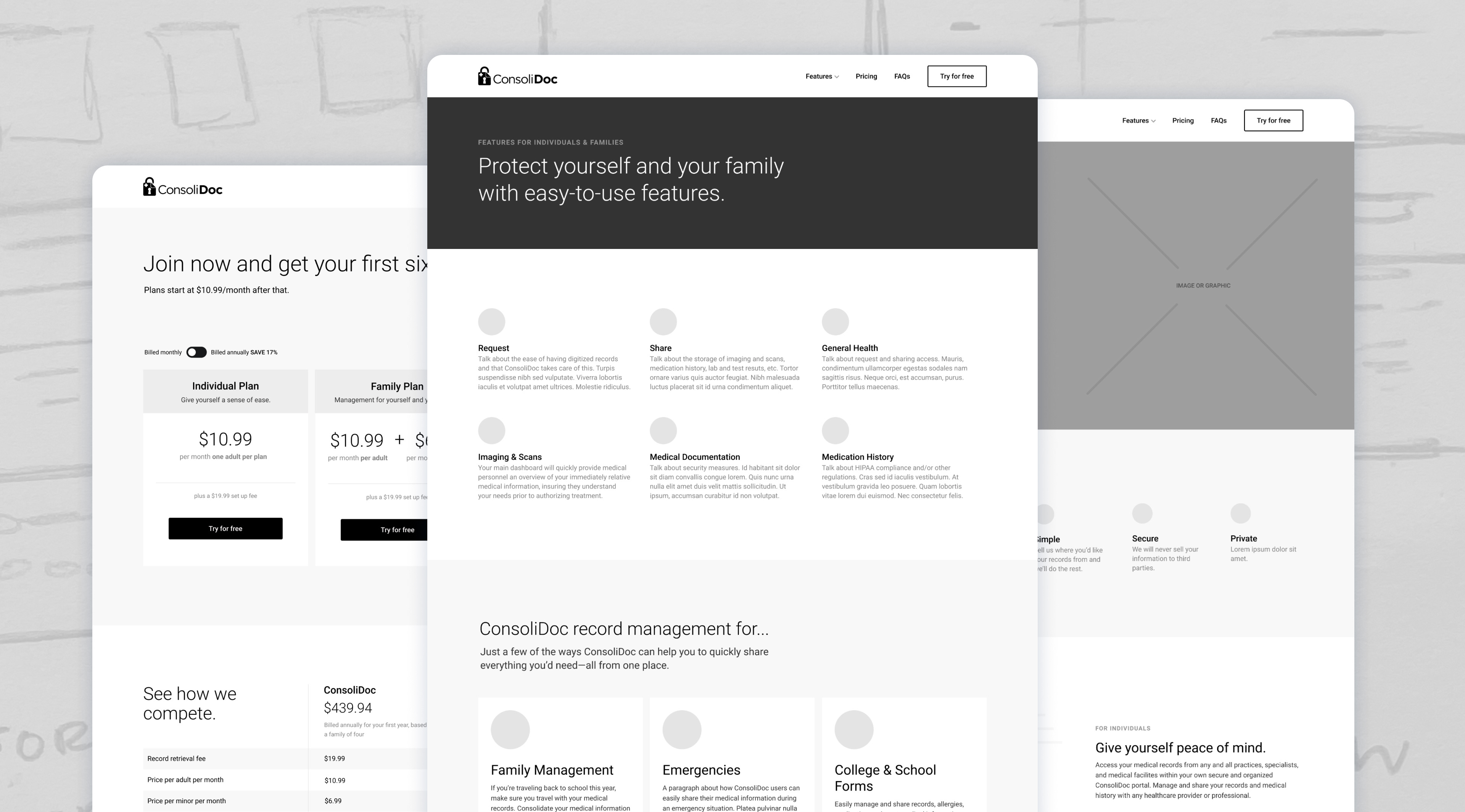
In the first phase of the design process, wireframes, beginning as pencil sketches, evolved into high-fidelity versions that served multiple purposes. They expedited decision-making, fostered stakeholder alignment, facilitated user interface design, and allowed key stakeholders to envision the final output, minimizing the risk for costly changes later on.
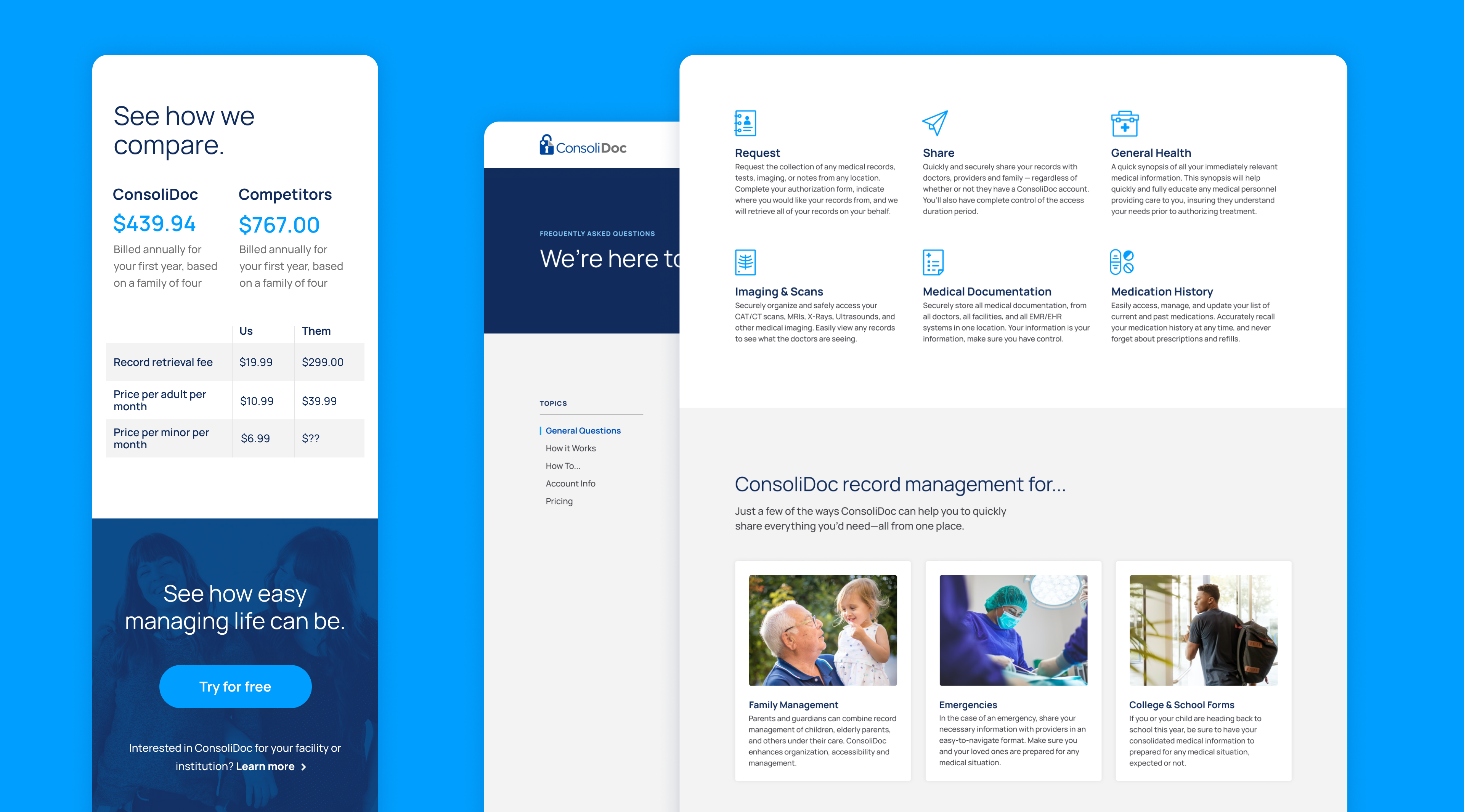
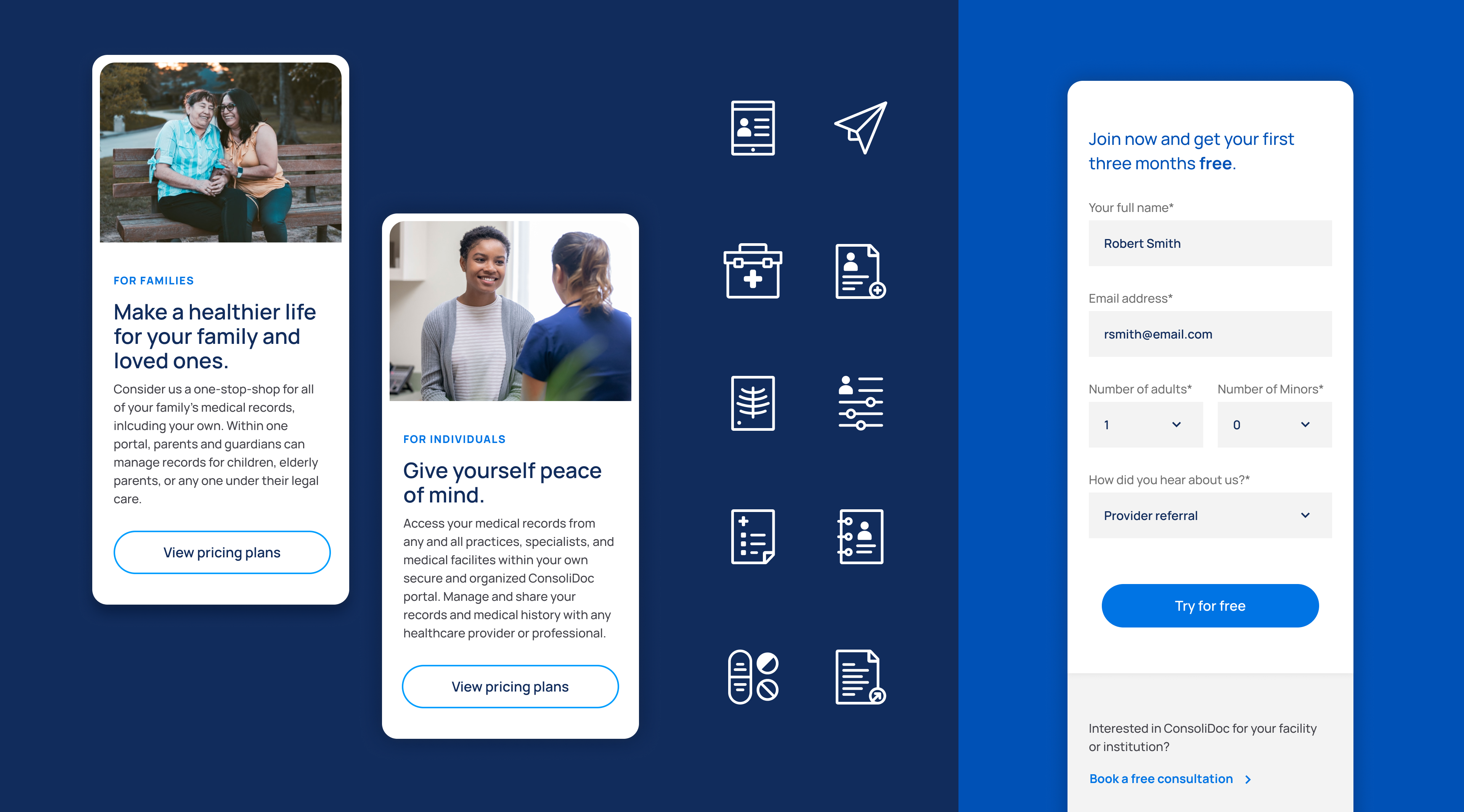
The design system was carefully crafted to create an approachable, simple, and clean visual experience for users across all age groups. With minimal decoration, the system is driven by approachable imagery and simple iconography, complemented by clean typography and a streamlined color palette that was inspired by the existing logo. Additionally, the strategic use of white space allows the pages to breathe and ensures ease of scanning and decision-making for users.
"
I think the design looks really great, the interface is very easy and self-explanatory. I like it a lot.
- ConsoliDoc User
Enhancing User Experience
Through Iterative Product Design
Through Iterative Product Design
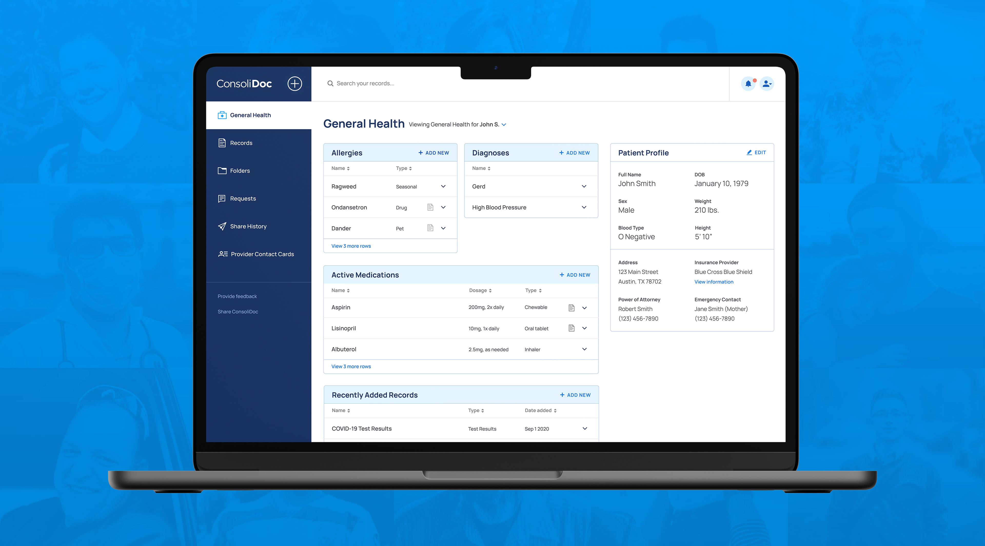
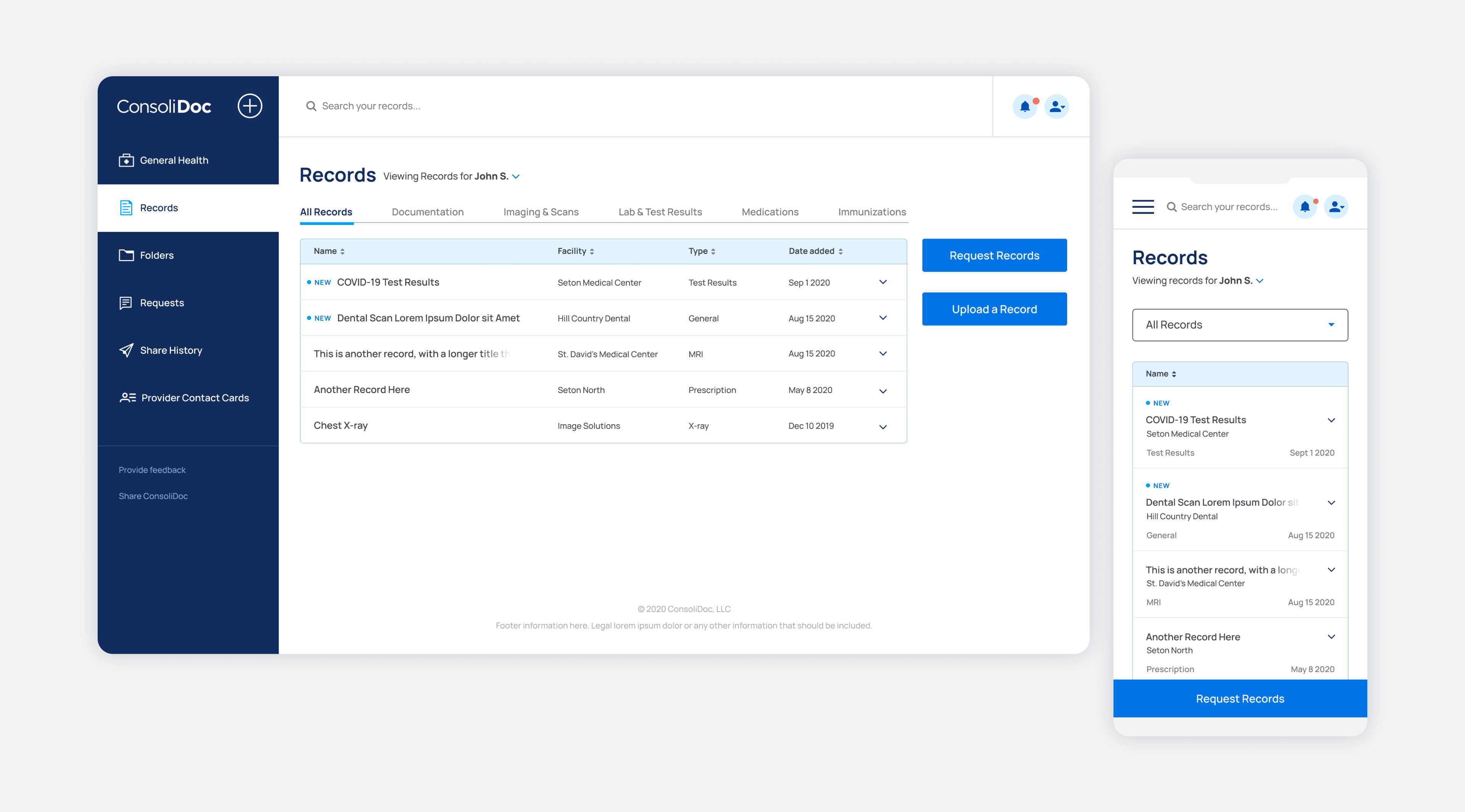
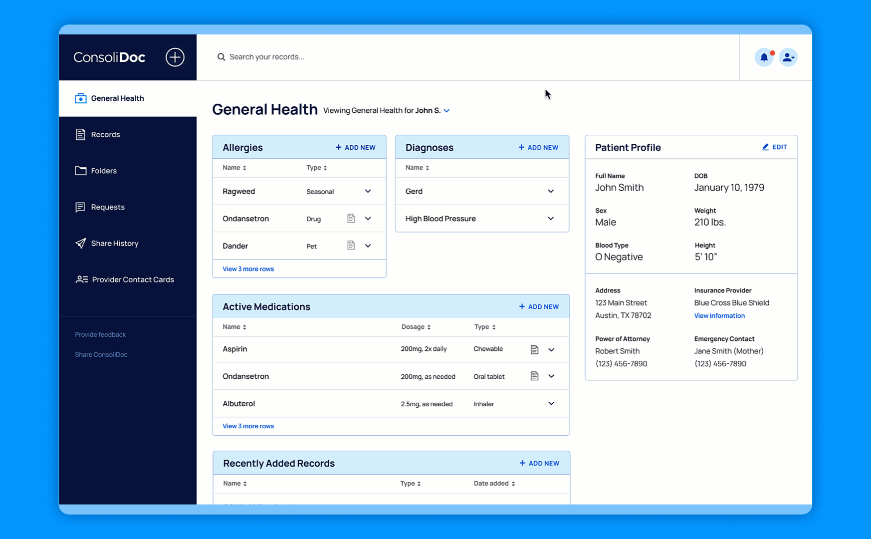
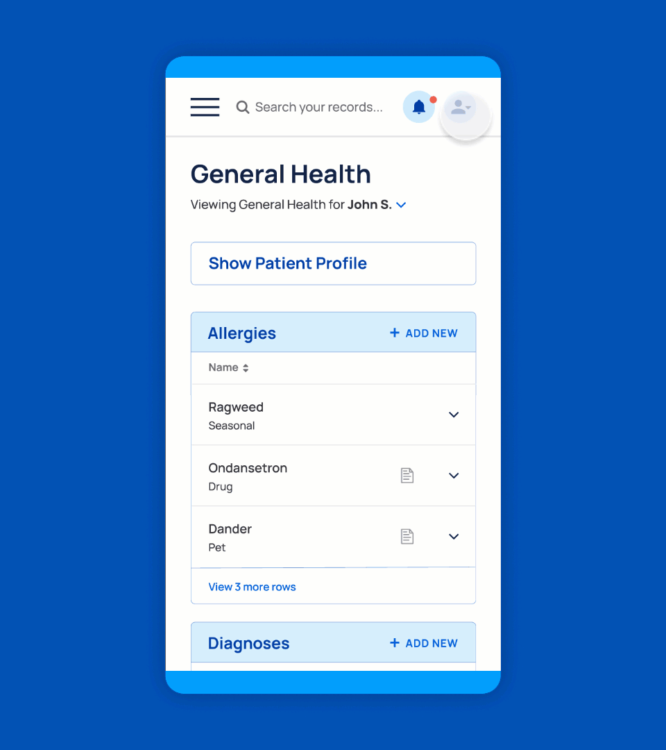
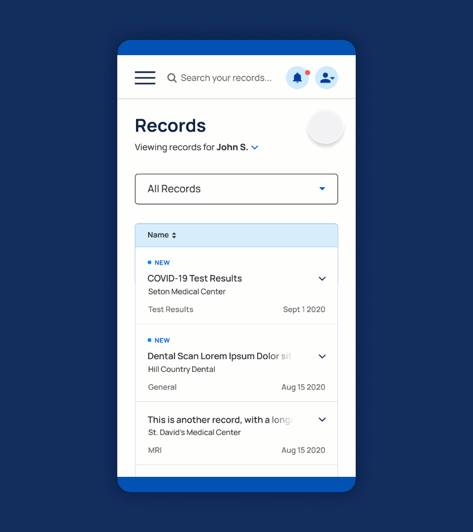
The product design phase began with auditing and building upon loose, existing wireframes and aligning with founders on user and business needs. I defined user flows and transformed them into a functioning wireframed prototype. Through testing conducted with a small user group, we diligently identified and addressed the pain points and challenges, refining the prototype to enhance the user experience. Armed with these valuable insights, I crafted the interface design, leveraging the foundational building blocks established during the website phase. Close collaboration with the developer ensured the intended implementation of all elements during the build phase and the responsive dashboard surpassed the client's expectations for the minimum viable product (MVP).
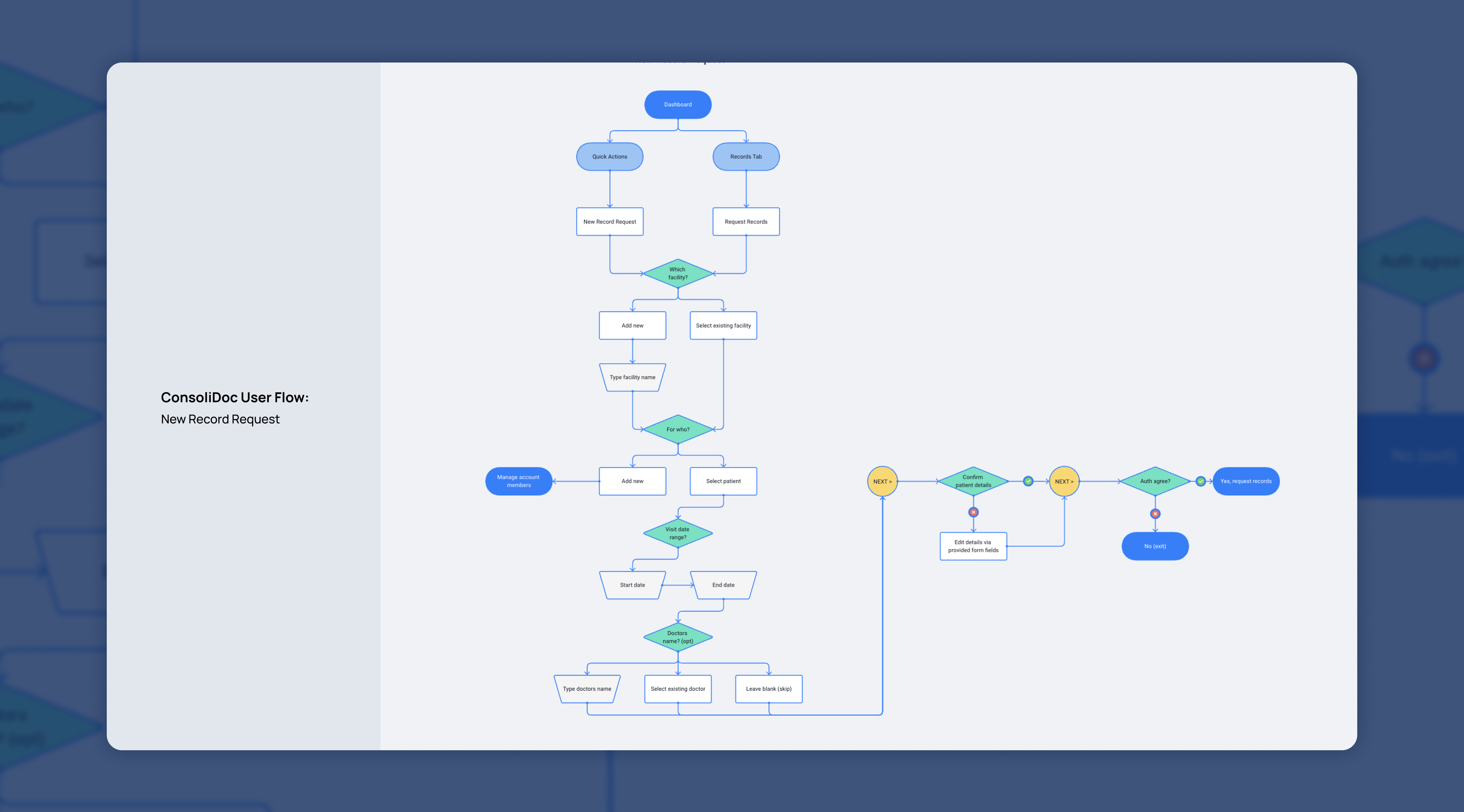
By leveraging user flows, I meticulously mapped out the sequence of actions users would take when engaging with ConsoliDoc, enabling a closer examination of key interactions such as requesting new records, uploading documents, and securely sharing information. Through this detailed analysis, we were able to identify potential pain points or inefficiencies, as well as areas where we could further enhance the user experience. The insights gained from these user flows helped us refine the product, ensuring a smoother and more intuitive journey.
Where appropriate, a streamlined modal approach was implemented for information requests in order to reduce users’ effort and enhance the efficacy of tasks. Additionally, a quick actions menu was incorporated to provide convenient access to common activities, complemented by the flexibility for users to take action directly within each tab, catering to diverse preferences and needs.
"
I think the system is great and the interface is amazingly easy!
- ConsoliDoc User
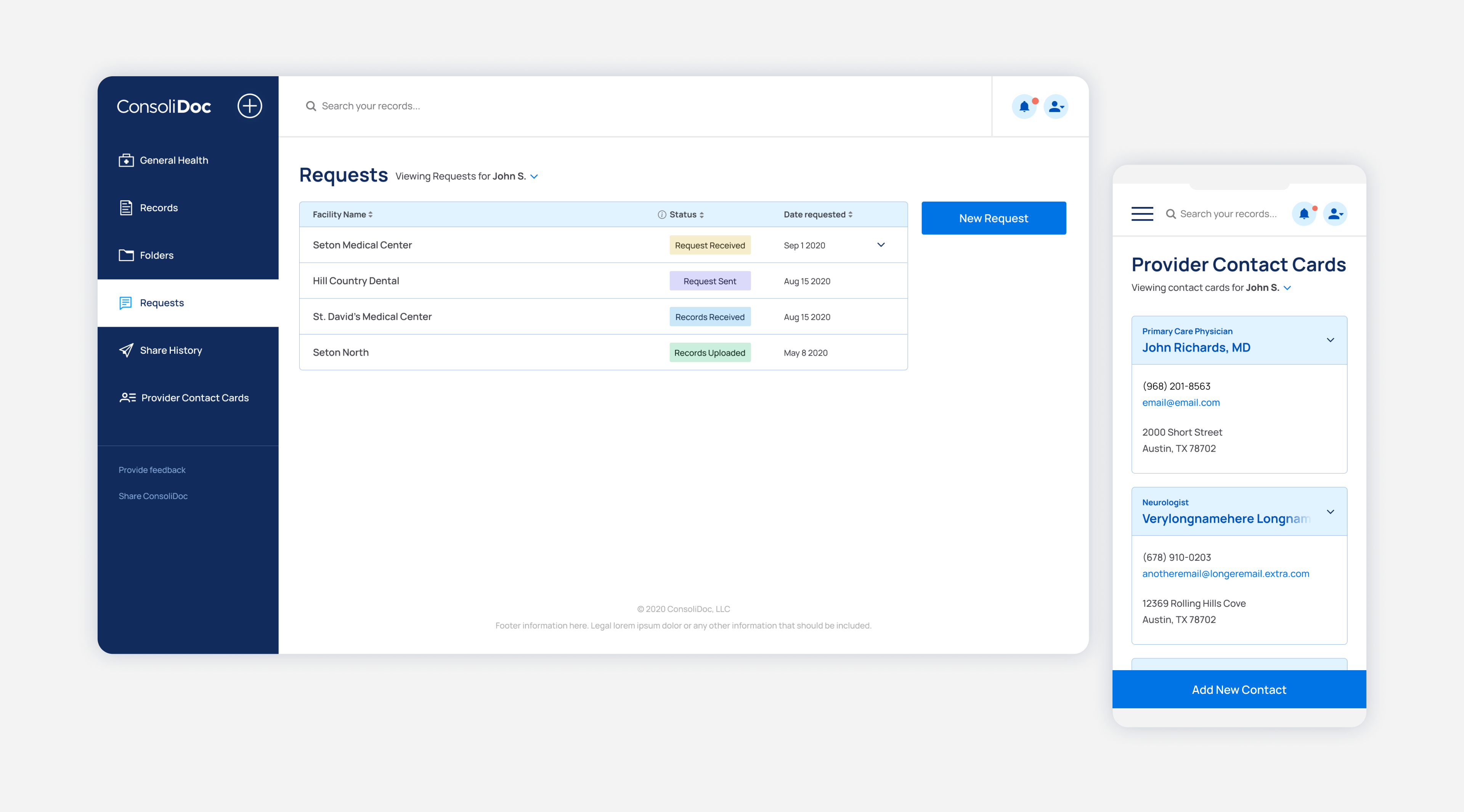
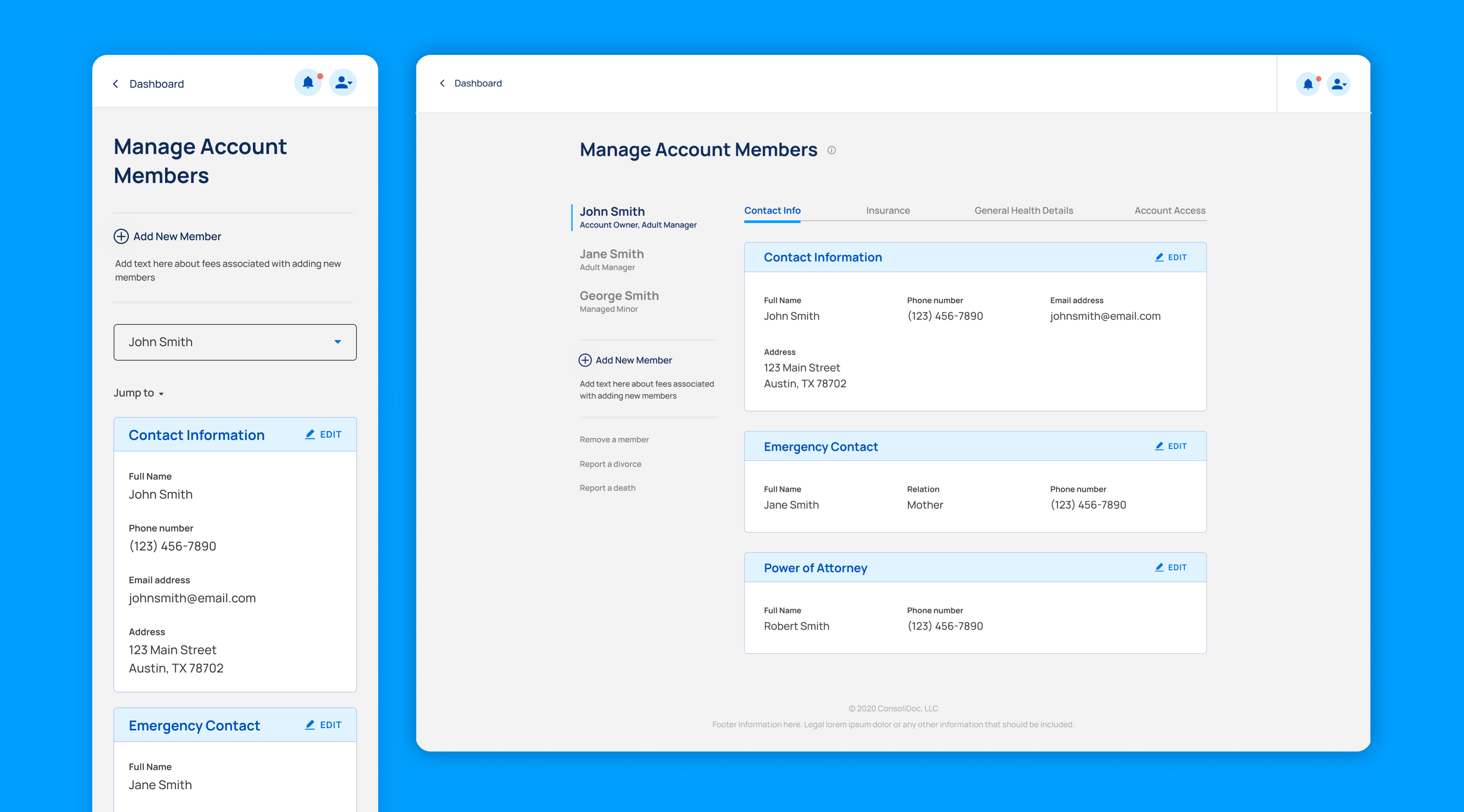
The dashboard design system was intentionally crafted with a minimalistic approach, drawing inspiration from the familiar setting of a doctor's office to create a sense of familiarity for users. Additionally, the choice of a subdued and stripped-down design system was driven by the project's timeline constraints, ensuring a focused and efficient development process.
Outcome and Conclusion
The website and dashboard design for ConsoliDoc embody simplicity, cleanliness, and ease of use, providing users with a seamless and intuitive experience. Despite facing tight timelines, the project not only exceeded client expectations but also achieved the objectives of the minimum viable product. The collaborative efforts between myself, the founders, and the developer were instrumental in delivering a successful product that effortlessly enables users to access vital health information with ease.